




September 16, 2026

September 18, 2025
September 10, 2025
July 3, 2025
Types of Charts in Technical Analysis: Line, Bar, Renko & More

Author
Shoonya Team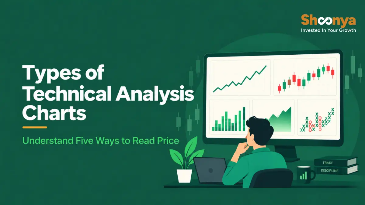
Open the same stock on two different chart settings, and it can look surprisingly different. One view may show a smooth trend. Another may reveal sharp intraday swings, changing momentum or important price levels.
The difference may simply be the type of chart they are using.
Technical analysis charts organise price data in different ways. A line chart strips the information down to a simple price line. Candlesticks show open, high, low and close. Renko and Point & Figure go further by filtering price movements according to predefined parameters.
Understanding the types of charts in technical analysis therefore helps you know not only how to read a chart, but also what information you are seeing and what information has been left out.
What Are Charts in Technical Analysis?
Charts in technical analysis visually organise market prices so traders can study direction, ranges, volatility and important levels.
The information displayed depends on the format. Some charts preserve Open, High, Low and Close data. Others focus on a selected price or filter movements according to predefined settings.
Five commonly used formats are:
- Line chart
- Bar or OHLC chart
- Candlestick chart
- Renko chart
- Point & Figure chart
How Can the Same Price Data Look Different Across Charts?
A single price series can look very different across charts because each format chooses what to emphasise.
Consider a hypothetical stock observed over 55 trading sessions.
- A line graph makes the broad direction easy to see.
- OHLC bars expose each session’s range.
- Candlesticks highlight the relationship between open and close.
- Renko filters smaller movements according to brick settings.
- Point & Figure uses boxes and reversal criteria to organise movement into columns.
This difference is why chart selection begins with a simple question: What information do you want to see clearly?
What Is a Line Chart?
A line chart connects a selected price, commonly the closing value, across successive periods.
Its simple construction removes much of the session-level detail and makes the broader direction easier to identify.
How Do You Read a Line Chart?
Start with these three elements:
- Overall slope: A generally rising line indicates upward movement over the selected period. A falling line indicates downward movement.
- Turning points: Major peaks and troughs show where direction changed.
- Broader structure: Since a close-based line does not display the complete intraday range, it is more useful for observing overall movement than session-level behaviour.
Suppose a stock opens at ₹500, touches ₹520, falls to ₹490 and closes at ₹505. A close-based line primarily plots ₹505. The movement between ₹490 and ₹520 is not visible.
How Can You Practise Reading a Line Chart?
Open a one-year line graph of an index such as the Nifty 50 without adding indicators. Identify its major rising, falling and sideways phases.
Next, view the identical period using a more detailed format. Notice which movements become visible once additional information appears.
What Is a Bar or OHLC Chart?
A bar chart, also called an OHLC chart, displays the Open, High, Low and Close for every selected period.
A vertical line represents the complete range. A small tick on the left marks the opening value, while another on the right marks the closing value.
How Do You Read an OHLC Bar?
The structure is straightforward:
- Top of the vertical bar: High
- Bottom of the vertical bar: Low
- Left tick: Open
- Right tick: Close
A long vertical bar represents a wider trading range for that period. A shorter one shows that prices remained within a narrower range.
The position of the opening and closing ticks also shows how the session developed from start to finish.
How Can You Practise Reading Bar Charts?
Switch a familiar stock from candlesticks to OHLC bars. Select individual sessions and try to identify the four values visually before checking the figures the platform displays.
This exercise builds familiarity with OHLC structure without relying on colour.
What Is a Candlestick Chart?
A candlestick chart presents Open, High, Low and Close information through a body and wicks.
The body represents the space between opening and closing values. The upper and lower wicks extend towards the period’s highest and lowest points.
Colours depend on platform settings. A common configuration uses green when the close is above the open and red when it finishes below.
How Do You Read a Candlestick Chart?
Focus on three components.
Body
The body shows the relationship between the open and close. Its size indicates how far apart those two points were.
Wicks
Wicks reveal how far the market travelled beyond the body during that period. A long upper wick, for example, shows that the price traded higher before finishing below that high.
Candle combinations
Neighbouring candles can create recognisable formations. These structures provide context about recent behaviour but do not determine what must happen next.
How Can You Practise Reading Candlesticks?
Pick five candles from historical data.
For each one, identify:
- Open
- High
- Low
- Close
- Body size
- Upper wick
- Lower wick
Describe what happened during the period before looking at subsequent sessions. This helps separate observation from hindsight.
What Is a Renko Chart?
A Renko chart uses bricks to represent movements that meet the selected brick criteria.
Unlike a conventional time-based display, a new brick is not automatically created simply because another fixed interval has passed. Smaller fluctuations that fail to meet the required threshold may remain absent.
The result is a cleaner visual representation focused on movements large enough to satisfy the chosen settings.
How Do You Read a Renko Chart?
Three features matter.
Brick direction
A sequence of bricks moving in one direction makes sustained movement visually prominent.
Direction changes
A brick appearing in the opposite direction shows that the required reversal movement has occurred under the selected configuration.
Filtering
Movements below the brick requirement may not appear as separate units.
The chosen brick methodology therefore matters considerably. Altering it can change how the identical market period appears.
How Can You Practise Reading Renko Charts?
Place a standard candlestick view and Renko view of the same security side by side.
Focus on a volatile or sideways period. Observe which small fluctuations remain visible on candles and which disappear from Renko.
Then adjust the brick setting. The resulting changes show why understanding the configuration is essential before interpreting the visual.
What Is a Point & Figure Chart?
A Point & Figure chart, often written as P&F, represents movements through columns of Xs and Os.
Xs generally show rising prices, while Os represent declines. Its construction depends on settings such as box size and reversal amount.
An opposite column begins only when the required reversal criterion is satisfied.
How Do You Read a Point & Figure Chart?
Pay attention to three features.
Columns of Xs and Os
Xs represent upward movements that satisfy the selected box criteria. Os represent qualifying declines.
Price levels
Repeated highs or lows across several columns can make certain areas easier to identify visually.
Reversals
A switch to the opposite column requires movement large enough to meet the selected reversal amount.
Settings play an important role here. Changing the box size or reversal requirement can alter the resulting structure substantially.
How Can You Practise Reading Point & Figure Charts?
Take a short historical price series and select a box size and reversal amount.
Plot the movements manually as Xs and Os. Repeat the exercise using different parameters.
You will quickly see how changing these values affects the amount of movement that appears.
How Do the Five Technical Analysis Charts Compare?
Each format differs primarily in the information it presents and the way that information is organised.
| Chart | Information Displayed | Visual Structure | What It Makes Easier to Observe |
|---|---|---|---|
| Line | Selected price, commonly close | Continuous line | Broad direction |
| Bar or OHLC | Open, High, Low, Close | Vertical bars with ticks | Session range |
| Candlestick | Open, High, Low, Close | Bodies and wicks | Relationship between OHLC values |
| Renko | Movement based on brick settings | Bricks | Moves that meet the selected threshold |
| Point & Figure | Movement based on box and reversal settings | X and O columns | Price levels and qualifying reversals |
How Are Bar and Candlestick Charts Different?
Bar and candlestick charts can display the same four price points. Their primary difference lies in presentation.
| Feature | Bar Chart | Candlestick Chart |
|---|---|---|
| Open | Left tick | Body boundary |
| High | Top of bar | Upper extreme |
| Low | Bottom of bar | Lower extreme |
| Close | Right tick | Body boundary |
| Main visual | Vertical line and ticks | Body and wicks |
| OHLC included | Yes | Yes |
Candlesticks make the distance between opening and closing values prominent through the body. OHLC bars communicate those points using smaller ticks.
Choosing between them is therefore largely a matter of how you prefer to view the same four values.
How Are Renko and Candlestick Charts Different?
A standard candlestick chart normally creates a candle for every selected interval. Renko construction depends on a required price movement under the chosen brick methodology.
As a result, candles preserve the selected time structure, whereas Renko can leave smaller fluctuations unrepresented.
A Renko brick should therefore not be interpreted as the equivalent of a daily, hourly or five-minute candle.
What Should You Check Before Reading a Technical Chart?
Before drawing conclusions from any market visual, check how it has been constructed.
- Timeframe: Is each period one minute, one hour, one day or something else?
- Price information: Which values does the format use?
- Historical adjustments: Has the series been adjusted for relevant corporate actions?
- Renko configuration: Which brick methodology and size are applied?
- P&F configuration: What box size and reversal amount are selected?
- Platform preferences: How are colours, sessions and other display settings configured?
Note: Charts organise market information for analysis. They do not provide certainty about future prices or remove trading risk.
Final Thoughts
Understanding these construction rules makes it easier to interpret what appears on screen and recognise what may be missing from a particular view. Shoonya’s charting and trading tools help traders explore market movements across different analytical views while making informed trading decisions.
Types of Charts : FAQs
What are the main types of charts in technical analysis?
Common formats include line, bar or OHLC, candlestick, Renko and Point & Figure. They differ in the information they display and the rules they use to organise market movements.
What information does a candlestick show?
A candle represents the Open, High, Low and Close for a selected period. Its body shows the relationship between the open and close, while the wicks extend to the high and low.
Are bar charts and candlesticks the same?
Both can show the same OHLC information, but they present it differently. Bars use a vertical line with ticks, while candlesticks use a body and wicks.
Does Renko use a fixed time interval?
Renko construction focuses on qualifying price movement rather than automatically creating one brick for every fixed interval. Its appearance depends on the selected brick methodology.
What do X and O represent in a Point & Figure chart?
Xs generally represent qualifying upward movements, while Os represent qualifying declines. Their formation depends on the selected box size and reversal criteria.
Can technical charts predict future prices?
No, technical charts organise market information for analysis but cannot determine future movements with certainty. Market prices remain affected by changing conditions and risk.


Explore Our Offerings

Stocks
Trade equities across NSE and BSE with zero delivery charges. Invest, hold or sell with a seamless experience.


Future & Options
Execute complex strategies with simple tools and real-time data.

IPOs
Apply to the latest IPOs in just a few taps. Stay updated and capture opportunities as they open.